 (photo courtesy of http://www.adamseal.com)
It is pretty difficult to avoid red. In fact, you almost have to go out of your way to avoid something that is red. In our culture, we consider red to be the color of a lot of severe things--it is the color of warnings (stop signs and traffic lights), it is the color of love and romance (Valentine's day hearts), it is the color of blood. Editors have traditionally marked with red pen because it asserts authority.
So what is red doing with my McDonald's cheeseburger? Simply trying to get my attention. It is a jarring color, not a calming one. Worth noting is that the largest graphic on the page is the golden arches--not only a spectacular branding, because it is such a ubiquitous and recognizable feature, but also a great opportunity to incorporate a splash of yellow, a color that has been proven to increase appetite.
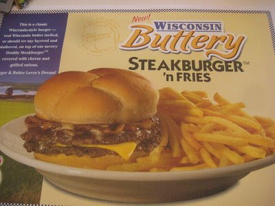
Above is another example of the use of yellow in an advertisement. This is actually a photo of a Steak 'n Shake place mat setting. It is assumed that if a customer is already sitting at a table inside a Steak 'n Shake, they are probably already hungry. This may be the visual that tips them over the edge--perhaps they've just got to have this Wisconsin Buttery Steak Burger and Fries. Even the french fries look enhanced by photoshop--they are looking especially yellow here. Hungry yet?
Interestingly, the background to the left is blue. Blue is proven to decrease appetite, which contradicts with the yellow that increases appetite. This case of the use of blue is a bit different than the standard usage, however, because the blue seems to comprise the sky in what appears to be a farm scene. There is also a landscape of vivid green grass. It all seems very natural--fresh cheese, fresh beef, nothing unhealthy about it, even the "buttery" part, right?
Did you notice that the "New!" is in red? Once again, grabbing our attention.


No comments:
Post a Comment